Choose a presentation image by the job it needs to do. A screenshot can locate a control, a diagram can explain a process and a photo can identify a physical detail. Decide the meaning before searching for a picture.
Write one sentence for the visual: “This image helps the audience see…” If you cannot finish it with something useful to the slide, reconsider whether the image needs space there.
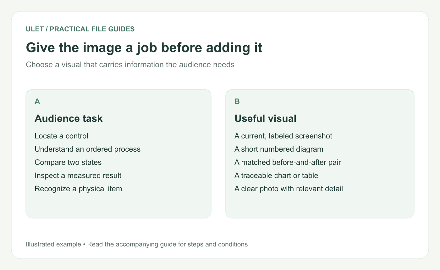
Give the image a job before adding it. Original instructional illustration; example values and layouts are illustrative, not software screenshots.
Match the visual to the task
Task | A useful visual |
|---|---|
Find a command | A current screenshot with one precise callout |
Understand steps | A numbered diagram showing order |
Compare a change | Before-and-after images at a comparable scale |
Understand a result | A chart or table tied to its source |
Identify an object | A photo showing the relevant part clearly |
A decorative background may set a tone, but it does not replace evidence for a claim. Give the informative visual the space and contrast needed to read it.
Check the source and the context
Use images you have permission to use and keep a usable source reference. For a software tutorial, check that the screenshot matches the version and state being explained.
Label diagrams and mockups as illustrations. A simulated interface can explain an idea, but it should not be presented as a real product capture.
Crop and annotate deliberately
Crop away irrelevant surroundings while retaining the labels or conditions needed to interpret the image. If a chart needs its axis or a screenshot needs its window title, do not remove those just to make the central detail larger.
Keep callouts short and position them beside the target. A large arrow that covers the control it describes makes the slide harder to use.
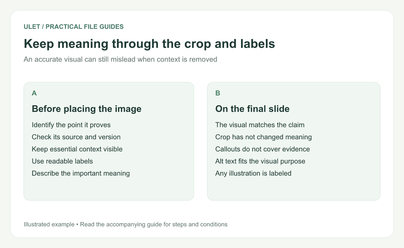
Keep meaning through the crop and labels. Original instructional illustration; example values and layouts are illustrative, not software screenshots.
Describe the meaning for readers who cannot see it
For an informative visual, write alternative text describing the point relevant to this slide. “Three review steps: prepare, check and approve” is more useful than “diagram.” Microsoft also recommends reviewing image descriptions and object reading order in accessible presentations. PowerPoint accessibility guidance.
Use the appropriate accessibility controls in the application where you validate the final deck. The description should agree with what the visible slide actually communicates.
Inspect the saved slide
Check labels at presenting size, compare any before-and-after pair at a fair scale and confirm the crop has not changed the meaning. Retain the original image for future revisions.
Ulet provides local presentation editing on Windows and macOS. Keep the PPTX and its original visual assets together so an image can be replaced or checked without recreating the source.