Choose a slide layout that matches the relationship in the content. Put alternatives side by side, arrange steps in a clear sequence and give a single piece of evidence enough space to be read.
Start with a rough sketch before adjusting colors or decoration. If the arrangement is unclear in a sketch, a polished theme will not explain it for you.
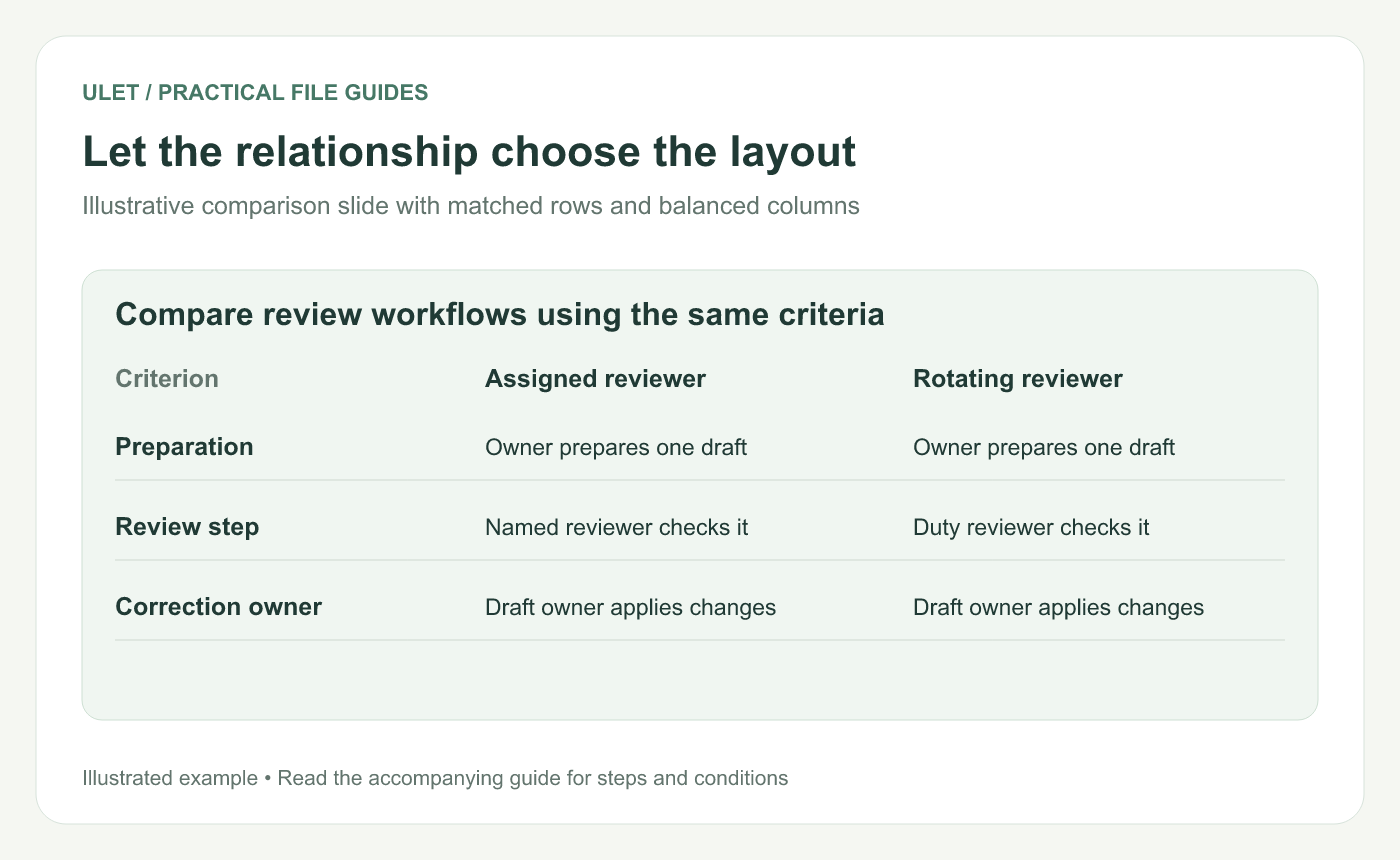
Let the relationship choose the layout. Original instructional illustration; example values and layouts are illustrative, not software screenshots.
Choose the relationship first
Content relationship | Useful starting layout |
|---|---|
Two alternatives | Two balanced areas with matching criteria |
Ordered steps | A numbered sequence with a visible direction |
One main finding | A conclusion title above one clear visual |
Problem and response | Two labeled groups with an explicit connection |
These are starting points, not rigid rules. A comparison with many criteria may need a short table or more than one slide.
Make comparisons genuinely comparable
Suppose you are comparing two review workflows. Use the same criteria on each side: preparation, review step and responsibility for corrections. Keep the labels in the same order.
Giving one option a large picture and the other a dense paragraph makes it harder to compare the actual differences. Give both enough space for the information the audience needs.
Set a clear path through the slide
Place the title where the reader expects to begin. Group labels with the objects they describe, align related items and leave space between unrelated groups. Use numbers when the order matters.
Do not rely only on a red/green difference or a tiny arrow to communicate meaning. Add words such as “Approved” and “Needs review” when that is the distinction.
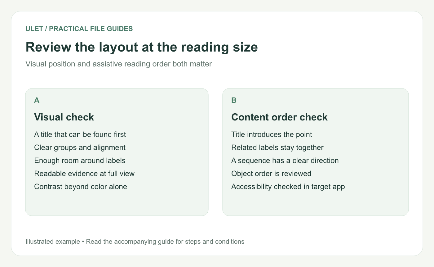
Review the layout at the reading size. Original instructional illustration; example values and layouts are illustrative, not software screenshots.
Check readability in the presenting view
Look at the whole slide at the size people will see it. Read the smallest essential label. If it fails, remove detail, simplify the visual or split the content before shrinking the type again.
Check the actual display or meeting setup when possible. A slide that looks comfortable while zoomed in on a laptop may be hard to read in a shared screen or larger room.
Review reading order separately
Visual placement alone does not establish the order used by a screen reader. Microsoft's accessibility guidance recommends descriptive slide titles and review of object reading order. Use the accessibility tools in the application where you validate the final deck. PowerPoint accessibility guidance.
Ulet provides local presentation editing with free basic tools on Windows and macOS. Use the layout sketch as a guide while positioning the PPTX's editable text and objects, then check the saved result.